When thinking about your logo design, colour is one of the most important elements to consider. Every colour creates an emotional reaction in people and these reactions are usually based on culture. In design, colour is used to help guide emotion and give people a particular feeling about a brand.
To help you choose the right colour for your logo design, here’s an explanation of the colour wheel with examples of companies who are conveying successful messages about their brand – without saying a thing.

Yellow in Logo Design
Connotations: Cheerful, friendly, positive, energetic, warm
Examples: McDonald’s, Shell, IKEA

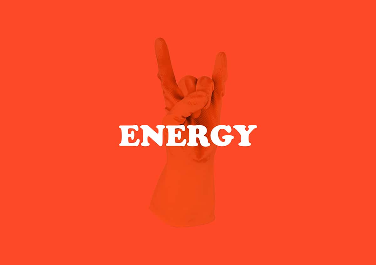
Orange in Logo Design
Connotations: Fun, friendly, playful, happy, warm
Examples: Nickelodeon, Fanta, Amazon

Red in Logo Design
Connotations: Exciting, bold, energetic, attention-grabbing, love, passion
Examples: Coca-Cola, Virgin, Kelloggs

Purple in logo design
Connotations: Creative, imaginative, wise, mysterious, sensual, regal
Examples: Yahoo!, Cadbury’s, Hallmark

Blue in logo design
Connotations: Dependable, strong, reliable, trustworthy, calm, serenity, peace
Examples: Dell, Facebook, Oral-B

Green in logo design
Connotations: Trustworthy, fresh, soothing, peace, growth, health
Examples: Whole Foods, Tropicana, BP

Black & white in logo design
Connotations: Elegance, Sophistication, Classic, timeless, calm, balance
Examples: Apple, Mercedes-Benz, Swarovski
Although colour is only one of many aspects of the logo design process, psychologists have found a strong correlation between colour and emotional response, proving that colour is crucial in determining how your brand is viewed.

(Illustrations by Matt Varker, Gorilla)
We hope you’ve found this post helpful but if you’d like any help or advice with logo design simply get in touch with us here