Whether by conscious decision or force of habit every designer has a formula for creating new work.
Overtime they develop a set of rules which guide the creative process to what they believe to be a successful outcome. While these unwritten rules are unique to each individual they are likely to focus on 6 key areas. We’ve illustrated these below for you.
Design Principle 1. Unity
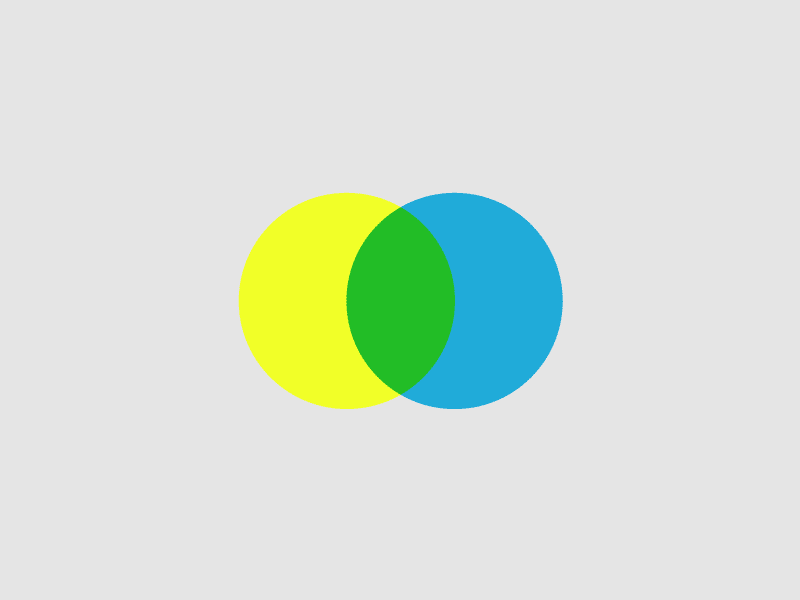
Unity is the feeling of harmony between all parts of a design, resulting in a sense of completeness. It’s worth bearing in mind though, that to avoid a chaotic or lifeless design, there needs to be a good balance between unity and variety. Some of the methods used to create unity include:

Proximity – The space between elements

Similarity – The ability to seem repeatable with other elements

Continuation – The sense of a line or pattern being extended

Repetition – Elements being mimicked numerous times
Design Principle 2. Balance
To make a design feel stable, elements such as colour, texture, objects and space should be balanced. There are three types of balance:

Symmetry – The elements on both sides of the design are similar

Asymmetry – The elements on both sides are different, but look balanced

Radial – The elements are arranged around a central point
Design Principle 3. Hierarchy
A good design will contain type and images that lead you through each element in order of significance, from the most important to the least.

Trees – The elements are arranged like a tree with a trunk and branches

Nests – The elements are mapped onto one another as ‘parents’, ‘children’ and ‘grandchildren’

Weight – Elements of the same weight belong to the same class of hierarchical positions
Design Principle 4. Proportion
Proportion is the feeling of unity that’s created when all elements relate well to one another.

Size – Elements of different sizes relating to each other. Using the relative size of elements against each other can draw attention to a main focal point

Ratio – Elements related to each other in a ratio appearing together in visual harmony

Divisions – The focal points which are created automatically give a sense of the relationships
Design Principle 5. Emphasis
This is the part of the design that draws attention. A designer will usually make a particular area stand out by contrasting it with other areas. The areas could differ in the following ways:

Shape – The visual hierarchy is broken using form to lay emphasis

Colour – Used to distinguish elements of similar forms

Size – Different sized elements focus attention accordingly
Design Principle 6. Variety
A good design will use similar and contrasting elements to hold attention and guide the eye through the image, towards a focal point. The key is to find the balance between similarity and contrast.

Light and dark – Contrast between elements can be created with clear foreground and background separation

Line – Contrast can also be created using varying textures and forms
Gorilla uses great design to build brands that refuse to blend in if you would like help or advice with your project then simply get in touch here
Info from wikipedia.com