In contrast to Coca-Cola – whose logo design has barely changed since its creation in 1886 – Pepsi has competed to be the world’s biggest soft drink brand by regularly updating its logo.
Initially called ‘Brad’s Drink’, Pepsi was created in 1893 by pharmacist Caleb Bradham before being renamed Pepsi-Cola in 1903. Although its name hasn’t changed since, its logo has undergone numerous tweaks and revamps. Read on to find out about the ways in which Pepsi’s logo design has changed over the last century.

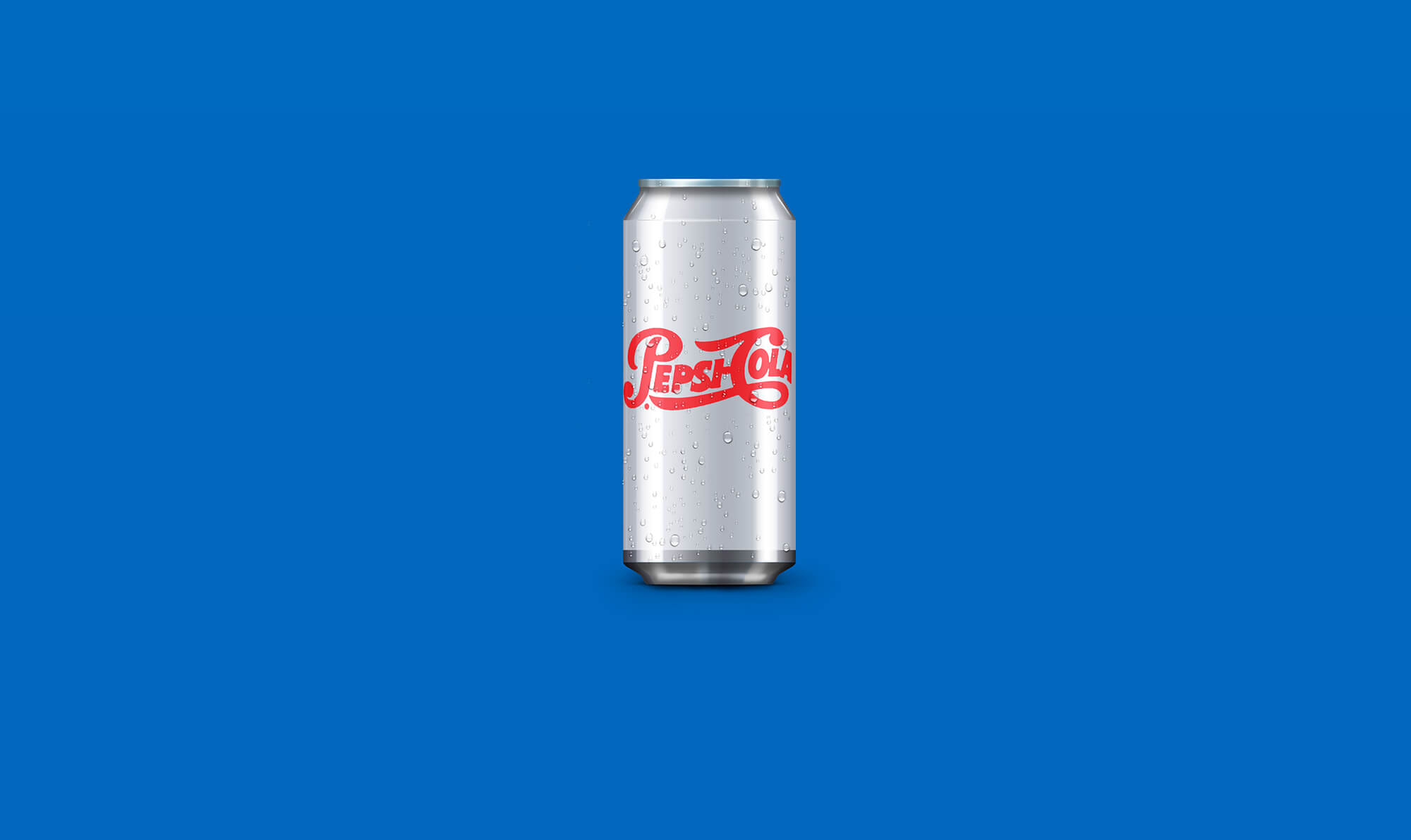
Pepsi logo 1898
Pepsi’s original logo was red script on a white background, meaning it looked very similar to Coca-Cola’s.
Pepsi logo 1905
Seven years later the typeface on Pepsi’s logo became more legible, however comparisons could still be made to Coke.
Pepsi logo 1906
Just a year later, the brand updated its logo again with just some small tweaks, such as making the typeface thicker and including the word ‘drink’.

Pepsi logo 1940
It stayed like that for 34 years – and although it was a longstanding logo design, it wasn’t considered to be ‘timeless’, as in 1940 it became simplified and much cleaner.

Pepsi logo 1950
Although nowadays we associate red, white and blue with Pepsi, this combination of colours wasn’t introduced until 1950. By also incorporating a round bottle cap in the design, this was the first major overhaul of the brand’s logo.
Pepsi logo 1961
In 1961 Pepsi kept the bottle top design, but scrapped the fancy script lettering for an easier-to-read sans serif font and changed the colour from red to black. Pepsi-Cola was also shortened to Pepsi.

Pepsi logo 1973
Twelve years later, the colour of the font changed to blue and the bottle top design was stylized into a circle with coloured stripes.
Pepsi logo 1987
Pepsi modernised its logo design in 1987 by changing the proportions of the swirls and choosing a typeface similar to the one which would be used for the next 16 years.

Pepsi logo 1991
A redesigned and streamlined logo was used in 1991, with the Pepsi text placed outside of the swirls for the first time.
Pepsi logo 1996
1996 saw the launch of ‘Project Blue’, in which Pepsi changed the background colour on the label to blue in several international markets outside of the United States. The launch included elaborate publicity stunts such as an Air France Concorde aeroplane painted in the new blue colours and a banner on the Mir space station.
Pepsi logo 1997
To celebrate Pepsi’s 100th anniversary, the blue design arrived in the United States in late 1997. Shading was used to add depth and the lettering became white with a blue outline.
Pepsi logo 2003
The logo was revamped again in 2003 when the Pepsi globe became more three dimensional and the typeface changed to a slightly more serif font.
Pepsi logo 2006
Pepsi’s 2006 logo design – in which the text was placed below the globe – was reserved for special edition cans and was the last time in the brand’s history that the lettering was uppercase.

Pepsi logo 2008
An entirely new logo was launched in 2008 which was two dimensional again, featured white outlines and the swirl was made to look like a smile.
Pepsi logo 2014
On its ‘Real Sugar’ product, Pepsi reintroduced the Pepsi-Cola script lettering, placing it next to the globe on a blue background.
Was it worth it?
So it has taken Pepsi 117 years to refine their logo design- the question is, was it worth it?
The end result is a highly simplified mark which has divided opinions since it’s release. While it has been said the new logo lacks character, it is undeniably more useful than some of their previous iterations. It is unique enough to be immediately identifiable as the face of soft drink giant, yet simplified enough to stand the test of time. Given half a chance it could probably see Pepsi through another 117 years of business without dating too badly- That said given their track record the marketing team at Pepsi won’t be able to resist tweaking it again in the very near future!