When it comes to designing a logo for your business, it takes more than just choosing a pretty colour and a nice font. That’s because when a customer comes into contact with your logo, there’s more going on than meets the eye. As well as colour and font, design elements like shape and the spacing between letters tell your brand story in an instant. With that in mind, here are some of the things you might want to think about when considering your logo design:

The colour of the logo design
Studies have shown that 84.7{44cca7f4264e26d874f0729c4a6201195eadd2d9005d407f79af304836415e4e} of consumers cite colour as their main reason for buying a product, with 80{44cca7f4264e26d874f0729c4a6201195eadd2d9005d407f79af304836415e4e} thinking colour increases brand recognition. When deciding on your brand colours, it’s important to remember that different colours have different connotations. Red, for example, suggests passion, love and energy, while green conveys growth, peace and freshness. Multi-coloured logos are generally used by brands such as Google, eBay and NBC, who want to come across as playful, positive and diverse.

Typeface selection
When choosing a typeface or font for your logo design, the options are endless. But whether you invent your own typeface or opt for one that’s already established, consumers will assume things about your brand just by looking at it. If you want them to perceive your company as trustworthy or strong, a classic serif font in uppercase letters like HSBC’s will have that effect, whereas sweet manufacturer Pez uses a font that represents the sweets it sells to give a simple and playful impression. But it’s important not to overlook the white space surrounding your letters too. For example, FedEx has minimal spacing between letters to suggest a tight, punctual service.

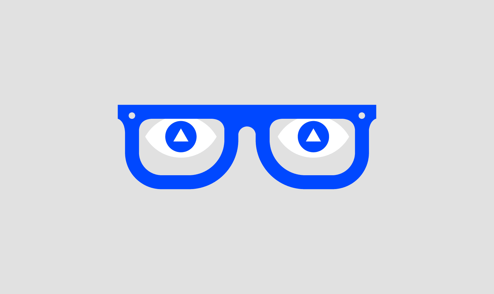
The form of the logo design
Research has found that our subconscious minds respond in different ways to different logo design shapes. Brands like Adidas and Mitsubishi use precise triangle and diamond shapes to connote strength, stability and efficiency. Our subconscious minds associate vertical lines with masculinity, strength and aggression, while horizontal lines convey community, tranquillity and calmness, with soft, rounded letters giving a youthful appeal. Circles suggest friendship, love and unity, rings imply marriage and partnership, suggesting stability and endurance and curves of any type tend to be viewed as feminine in nature.
Gorilla help companies of all sizes build unstoppable brands, if you would like help or advice with your project then get in touch here
(Illustrations by Matt Varker, Gorilla)