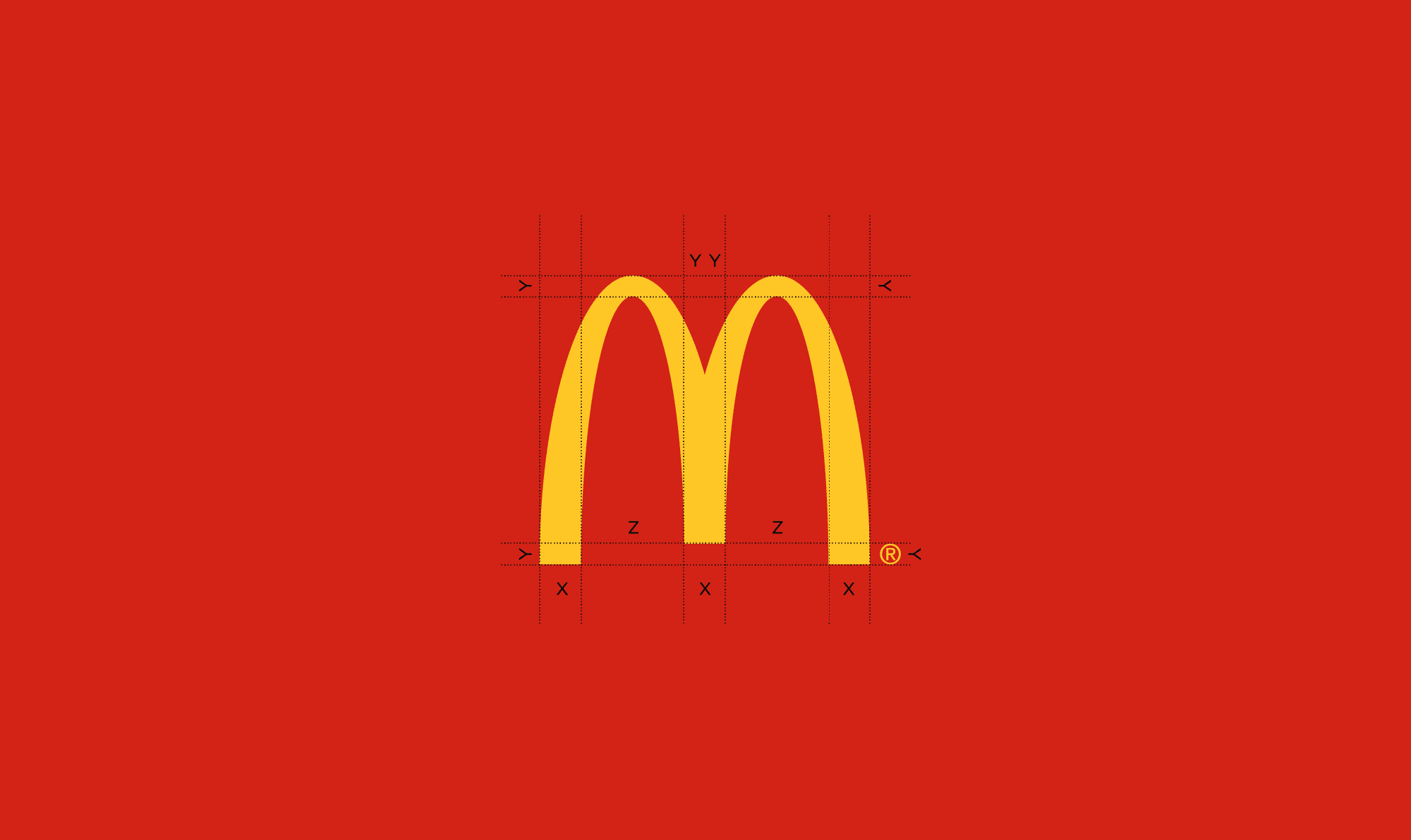
You’d be hard pushed to find someone in the world who doesn’t recognise the McDonald’s infamous golden arches. One of the most iconic logo marks in history, it’s instantly familiar and represents much more than fast food. Created by Jim Schindler in 1962, it’s now a cultural icon that’s synonymous with globalisation, capitalism and American culture.
But what exactly is it that makes the fast food chain’s logo design so successful?

1. McDonald’s logo design: Shape
Perhaps the most important design element of the McDonald’s logo is its shape. Initially designed to resemble the arched-shaped symbols on the side of the newborn restaurant, the golden arches have since been merged to outline the simple, golden-coloured ‘M’ that’s not only recognised all over the world today, but also depicts elegance, significance and solid corporate character.

2. McDonald’s logo design: Colour
To represent the brand’s bold nature, two prominent shades of yellow and red are used in McDonald’s logo design. Primary colours like red and yellow are the most eye-catching of the colour wheel and appeal to everyone, from children who associate bright colours with toys to commuters who are in a hurry to find something quick and convenient to eat. What’s more, these colours connote qualities such as strength, power and confidence, reassuring customers that they can have trust in the company.

3. McDonald’s logo design:Typeface
Although the simple ‘M’ on its own is instantly recognisable to most people, the brand also has a type-based logo. Sticking with simplicity, the typeface is bold and easy to read – proving that the simpler the logo design, the more attractive it becomes to the viewer.
When thinking about your logo design, it’s important to understand that the need for establishing a prominent and appropriate trademark is a vital requirement for every company. This is especially true for firms considering global expansion. Like all successful businesses, McDonald’s uses its logo worldwide to project its brand ethos and validate the quality and authenticity of its product, as well as to avoid tarnishing its reputation.

