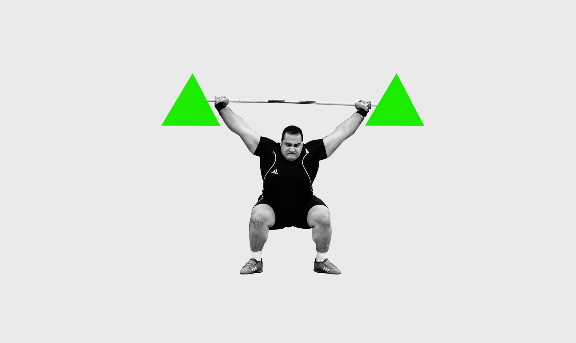
In our post on the psychology of logo design, we touched on the significant impact shape can have. Our subconscious minds react differently to different shapes, so when you’re designing a logo for your business, it’s important to have a think about what form you might want it to take. Here are some things you might want to consider:

Logo design: Circles, ovals and ellipses
Logo designs like Pepsi, Land Rover and Hyundai convey a positive emotional message. Circles can suggest friendship, relationships, love, community and unity, with rings implying marriage and partnership which can suggest stability and endurance. All types of curves are generally considered as feminine.

Logo design: Triangles and squares
A straight-edged logo design indicates stability in more practical terms and can also be used to imply balance. Straight lines and precise shapes can also impart strength, efficiency and professionalism and it’s been suggested that triangles have a good association with power, science, religion and law. These tend to be viewed as masculine attributes, so it’s no coincidence that triangles feature more prominently in the logos of companies whose products are aimed at a male target audience, such as Mitsubishi, Lego and Adidas.

Logo design: Vertical and horizontal lines
While vertical lines are associated with masculinity, strength and aggression, horizontal lines convey community, tranquillity and calmness. Some examples of these types of logo design include IBM, Honda and Toblerone. The implications of shape also extend to the typeface chosen. Jagged, angular fonts may appear as aggressive or dynamic, whereas on the other hand soft, rounded letters can give a youthful appeal.
So as well as font and colour, shape plays an important role in the psychology of logo design and a skilled logo designer can use shape to infer particular qualities about your brand.
Gorilla help companies of all sizes build unstoppable brands, if you would like help or advice with your project then get in touch here
(Illustration by Matt Varker, Gorilla)


True on your analysis of shapes. Additionally the circle/sphere have a tendency to draw the eye in more efficiently. They are the most powerful for logos. Consider the ‘bulls eye’. Try to create a circle without the concentric circle. Now you have a shape that draws the eye in. In branding that is ideal.